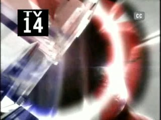
 This may seem like a small point, but I thought it was interesting (especially being an aspiring filmmaker myself) to note that both TDS and TCR have, over the past few weeks, been showcasing new transitions between their commercial breaks, in addition to the ones they've been using for the past few years. Personally, I don't really like the new ones for The Daily Show, as I feel they are flatter and not as nice to look at. I also feel that they don't quite fit with the overall feeling, execution, and look of the program. The new one for The Colbert Report, however, I like a lot, as I feel it is not only colorful and pleasing to the eye, but also works well within the context of the show.
 Here are a few examples of the ones The Daily Show has been using for the past few years (which are still being used, as well):
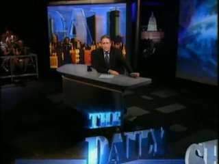


 Now, in some of the frames, they look okay, but in others, I don't feel that they work as well as the old ones. The first two, in particular, I don't like (they are a part of a separate transition than the other frames). As you can hopefully piece together from the frame succession, the text of "The Daily Show with Jon Stewart") zooms in from off screen, kind of assembling itself at the bottom of the page, and then zooms off screen.
The new transition for The Colbert Report, however, I feel works much better. Here are a few examples of transitions the show uses, with the last one being a frame from the new one:








No comments:
Post a Comment